Most traders prefer to use candlestick charts for their analysis.
I recommend to traders I train or mentor that if they decide to use candlesticks to include Heikin Ashi in their analysis too. More so for exiting positions as the structure of the candles provides more insight into when the current trend has ended, and sentiment has changed. Heikin Ashi has a smoothing effect as each new candle starts at the midpoint of the previous candles open/close making the colouring of the candles more consistent and flowing, thereby making it easier to identify that change in sentiment (as demonstrated in the comparison below). The candlestick chart (at the top) has a mix of red and green candles during the trends whereas the Heikin Ashi (below the candlestick) shows more consistent colouring allowing the trader to have the confidence to stay in the trade longer.
Due to the fact Heikin Ashi always takes that midpoint of the previous candle it will not provide any gaps as seen when comparing the two charts around mid-September.
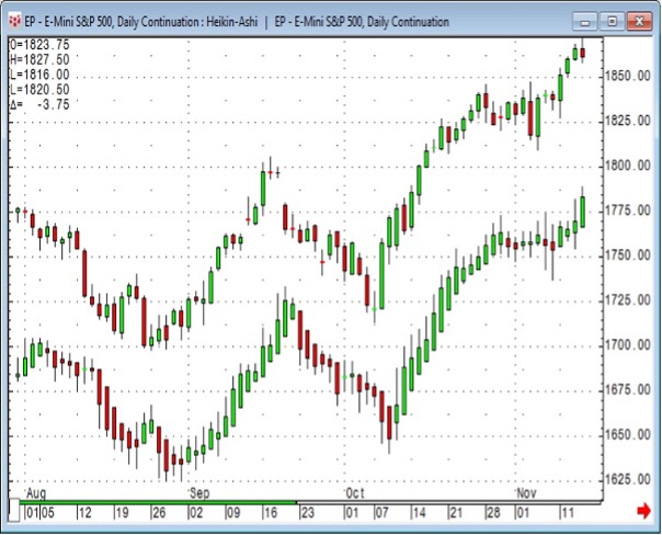
Chart courtesy of CQG.
NOTE: Heikin Ashi should not be used for analysis or back testing, it is really a visual display of sentiment.
For a deeper understanding of this, see it in action and other analysis tips that pros use, sign up for a Symax Fintech Academy one-day technical analysis workshops.